

.svg)

.svg)

.svg)


-2.svg)


About this time last year we started telling everyone that we were in the process of building out our new user interface and that it would be ready for release early in 2013.
Early 2013 came and went without a new interface.
Having missed that first deadline we expected to see some changes later in 2013.
Late 2013 has pretty much come and gone and still we don't have the new user interface in production. And everyone is rightly asking "where is the new UI?"
To date the answer has been "we are working on it." But we need to put a little more substance around that statement and provide some detail around what that all means to our users, hence this blog post.
To be fair "working on it" is a massive understatement. A team of fifteen front and back end developers, designers, QA, BA's and product managers spend pretty much every waking moment immersed in the rebuild of the WorkflowMax user interface . And they have been for the past 12 months.
What we have found since embarking on this project is that redesigning and then rebuilding the interface for an application as extensive as WorkflowMax is a massive, massive job - in fact much bigger than anyone first anticipated.
When Chris and I first started building WorkflowMax back in 2007 the process was very simple, a scoping session usually on a whiteboard, followed by a quick screen and process flow (again usually on the whiteboard), then Chris got down to writing the code with no separation between front and back end development resource, it was tested and then rolled out. Being early stage startup we could afford to roll to production, garner feedback, refactor and roll again. The process with the new user interface rebuild couldn't be more different.
The first step is design. Now that WorkflowMax is owned by Xero, the idea is to take WorkflowMax and make it look and feel like a Xero product, which means leveraging on the Xero user interface design team. Xero has some of the best user interface designers on the planet, they are a seriously talented group of people and it is testament to this team that Xero is constantly winning awards around the globe for its amazingly simple, elegant and beautiful interface. This doesn't happen by accident.
The process involves the design team working through the current interface in conjunction with the product manager and BA's determining what is relevant, important and purposeful in the screen/process they are dealing with. The designer will learn and understand everything to do with the screen/process in depth and investigate options around improving the interface stylistically and also working through improvements in the flow of the software. This takes time.
We are trying to get the flow as near to perfect as it can be, so a huge amount of effort goes in up front, rather than having to revisit later on once the code is actually built and it becomes an even bigger task to unravel any potential issues. As an example the new Quote Manager screen and quote creation screen flows took twelve weeks to design.
As you can see the new styling makes everything so much cleaner and just a whole bunch nicer to look at:
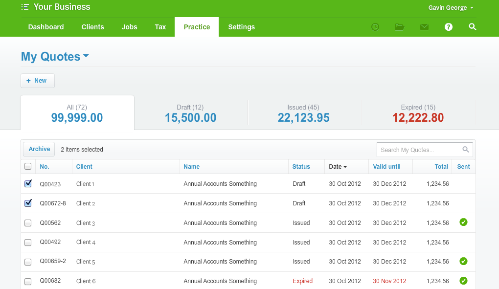
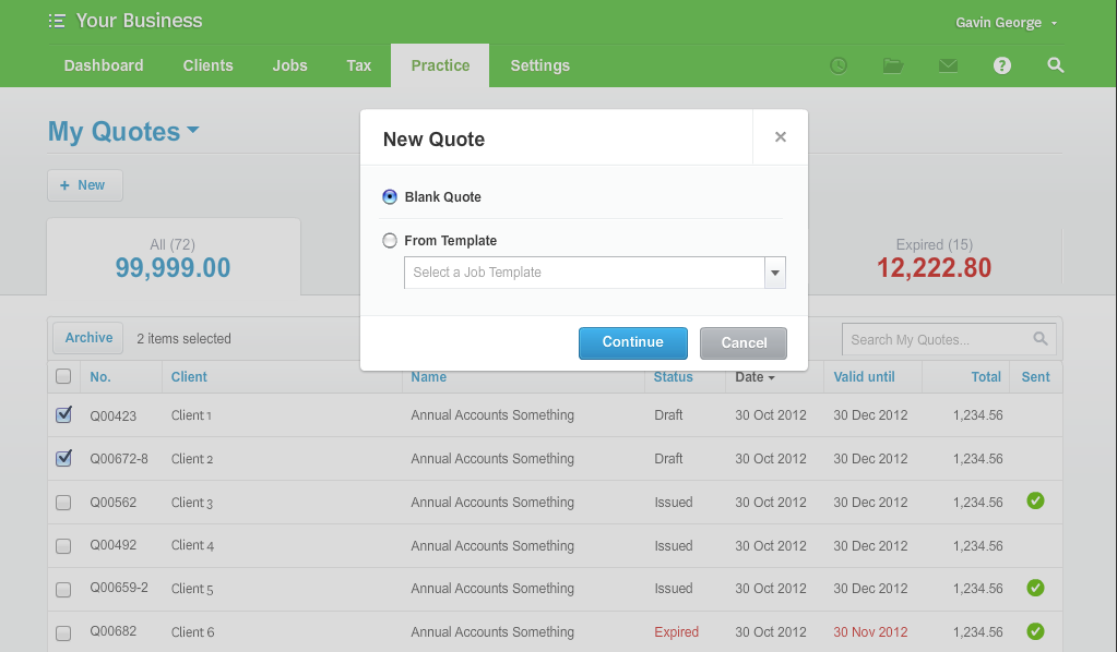
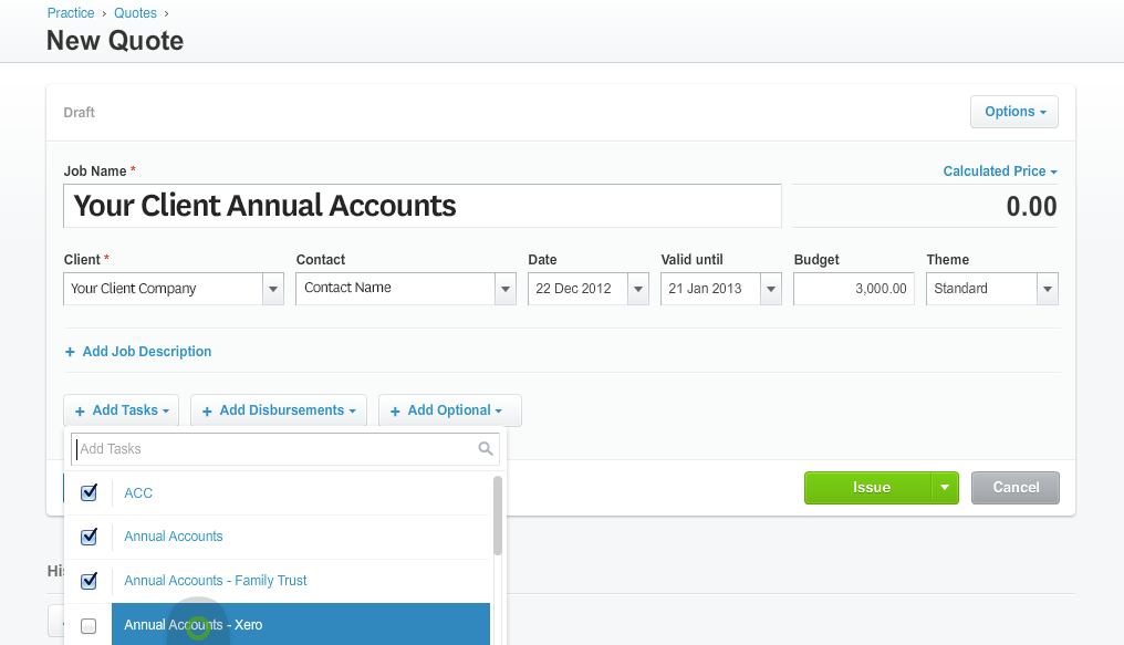
But it isn't just the styling that improves, it is also all of the flows. Take for example creating a new Quote. The first step is driving users to take advantage of the Job Template functionality:
The details all appear in a simple and easy to read format once the quote is created, with a major change allowing for inline editing rather than jumping out to a new edit screen
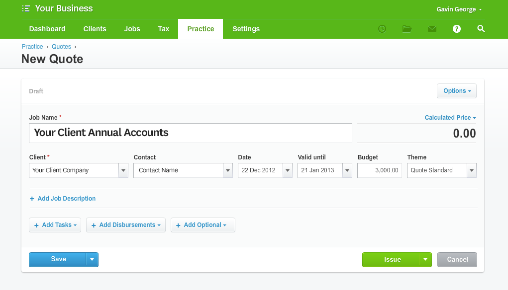
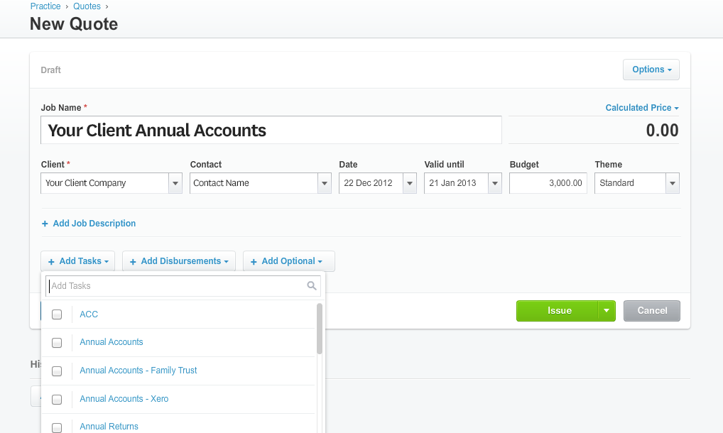
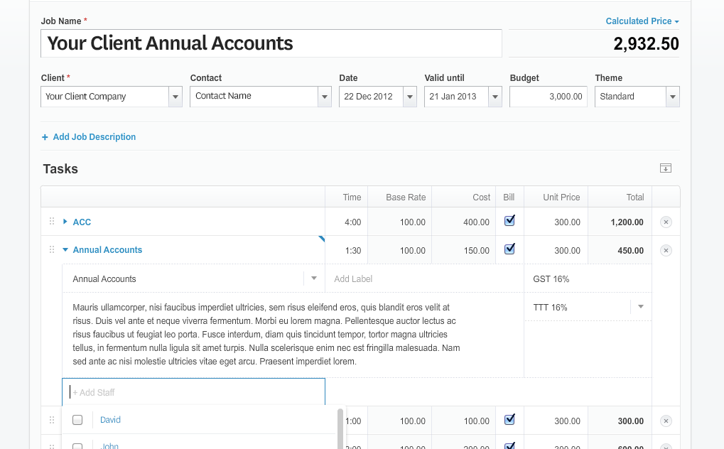
The inline editing functionality extends to Tasks, Costs/Disbursements and Options. So rather than forcing the user out to a new screen to edit the description, hours, rates, and staff assignments on a task it can all be done on the same page
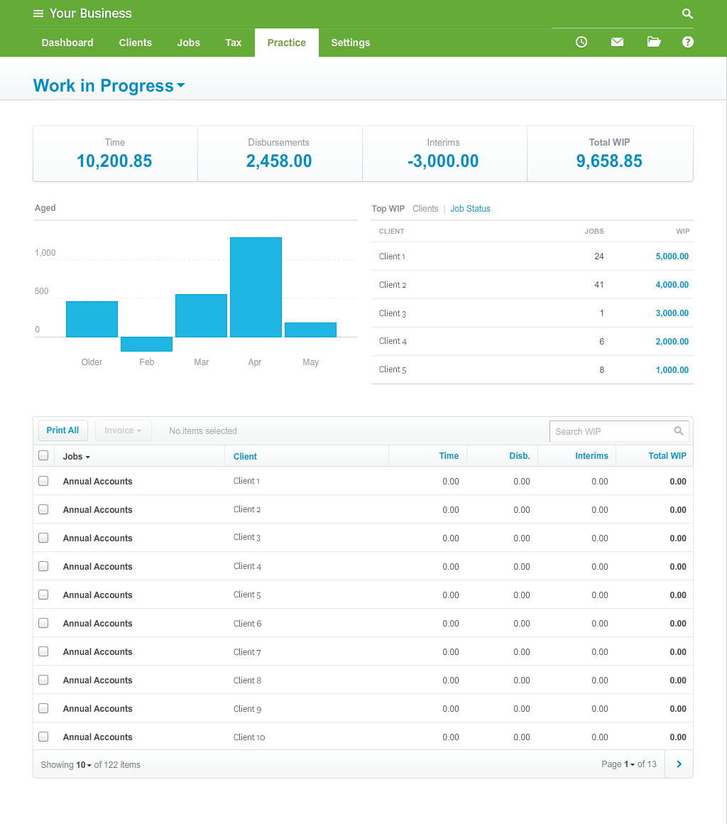
The other added complexity of the design process is introducing new views, new dashboards and new interactions that we haven't thought about or built previously. This is the really fun part, because it is about adding value to the interface re-write, not just about refactoring the old, but about creating views that will provide additional clarity to business owners and significantly improve their business process. The new 'Work In Progress' screen is an example of this. The screen shot below is definitely not finalised and is yet to be decided on what form it will take once in production, however what it illustrates is a new way of thinking about billing. The new design presents your aged WIP, and allows filtering and sorting, while showing the value of each individual jobs WIP with the ability to multi-select and produce a billing run right from this screen.
Once the designer has worked through the first iteration of the new flows, this is passed back into the wider design team to peer review. Additional tweaks, improvements and suggestions are floated and the design is refactored again. The end result of this process is always very special and every time I see a new design flow available it feels like Christmas and I can't wait to see it in production.
The second stage finds the design flows in the hands of the front end development team. This is the true acid test, although it may look super awesome from a usability perspective, to actually build out some of the designs can prove exceptionally challenging if not impossible. A massive amount of development effort is required to bring the designs to life - the challenges are immense as some of the newly designed interactions haven't been built by anyone, anywhere - so it is up to our very gifted front end crew to break new ground. The one good thing is that even though a huge amount of effort can go into building out a single control, once it is built that same control can be re-used right throughout the application.
As an example take the brand new filter control we are building. Filtering is going to play a huge part in the new user interface, with the ability to filter on pretty much every 'manager' screen, so you can filter out all superfluous data and look at only the pieces of information that are relevant to you. For instance you may be looking at the quote manager, but want to filter out all quotes for a certain set of clients that you are the account manager for. You could select from a list of already created filters:
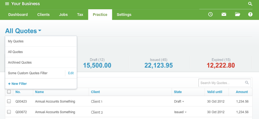
Or you could create your own, save it and reuse it time and again.
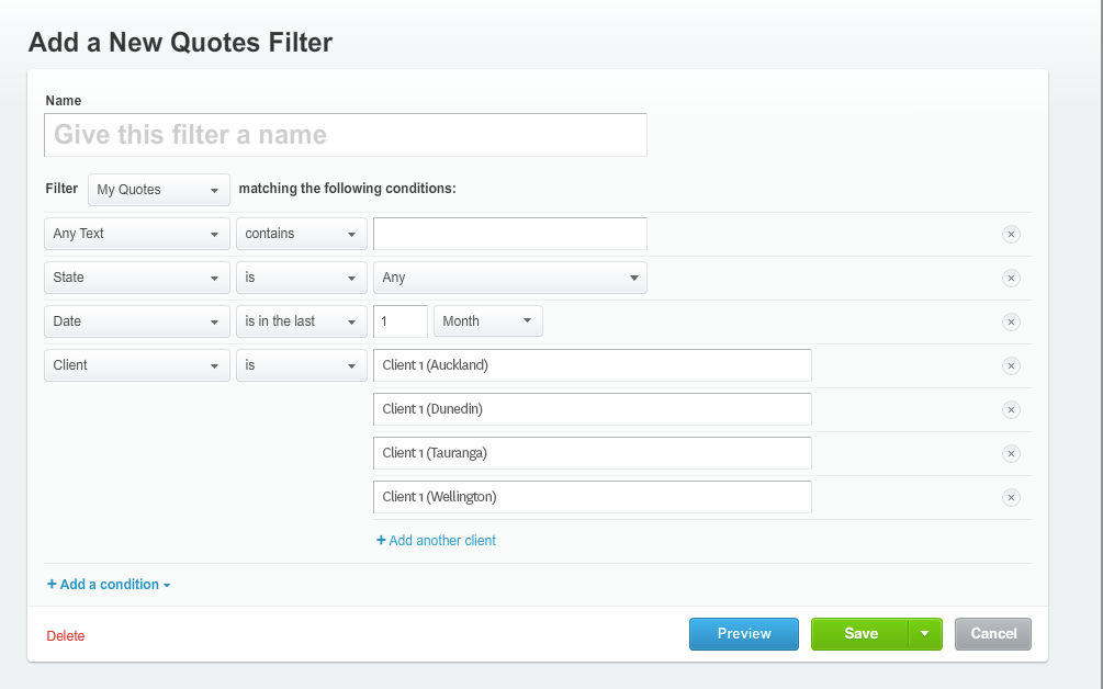
Some of the controls within the screen above for instance the date control or the multi-client select list are re-used in different parts of the application. So the philosophy of build once and re-use where possible is still paramount.
Once the front-end team have completed their work they hand it across to the back end development team which 'plumbs' it all together. They take the new controls, grids and fields and connect them into the underlying business logic that is already in place, tweaking and adjusting the core application where necessary to fit the new user interface requirements. This step although not as time consuming as the front end side, still involves a lot of patience and needs to be hugely accurate so as to not disrupt the core functions of the platform.
With the back end all connected to the new user interface, the Quality Assurance team are tasked with breaking it as the last step in the release process. A team of three testers are working full time on trying to break the new user interface. Every pixel that isn't in the right place, every button that performs something incorrectly is pushed back into development for rework before released back into testing again.
This entire process is repeated time and again for the hundreds of screens that make up WorkflowMax. It is a massive exercise.
However the end result, when we do get there, will be magnificent. Today we don't have a release date we can lock in or publicise. But rest assured we are working day and night to get this project completed and I will be publishing regular blog updates as we roll forward with development giving everyone a sneak preview of what we will see released next year.
So please be patient and bear with us, we are more determined than ever to bring you the best job, task, time and invoice management solution on the planet and I'm confident that once released, you will agree it has been worth the wait.
