

.svg)

.svg)

.svg)


-2.svg)


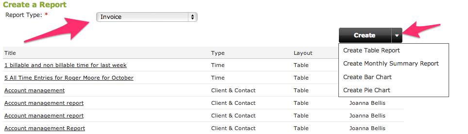
As many of you know the Report Builder is a highly flexible and powerful tool for extracting specific data out of your WorkflowMax account. What few people know, however, is that the Report Builder can also be used to create monthly summary reports, bar charts and pie graphs - making your data much easier to relate to. So how do you do it? Jump into the Report Builder select the Report Type you want to create, then hover over the drop down arrow next to the 'Create' button and you will see the four alternative report options:
- Table report (standard list report)
- Monthly Summary
- Bar
- Pie

Let's take a look at each of the options in turn using the 'Invoice' report type for each.
Monthly Summary Report
The monthly summary report option presents the 'Fields' section differently. Because it is a monthly summary, dates play a crucial role. So the data you are reporting on needs to be date driven eg invoice date, quote accepted date, time sheet entry date, invoice paid date. In the example below we have selected the invoice date, because it is a monthly summary we want to see all invoices 'From' June 2013 and for a period of 6 months subsequent to that date.
I want to see the invoices grouped per client so have 'Grouped' them as such and the figure we are reporting on is the 'Invoice Amount'.

I haven't put any criteria around it but I could potentially have restricted the data to only show invoices above a certain value, or only paid invoices, or invoices for a certain selection of clients.
Publishing the report gives me a nicely grouped breakdown of invoices by client per month for the last six months so that I can see in which months and with which clients I am doing most of my business.

Bar Chart
The bar chart graph is even simpler again, you only have two fields of data to select, the X and Y axis of the graph.
In this example I have chosen the Client as the X axis and the Invoice Amount as the Y axis. I have also added in criteria so that only invoices summing greater than $50,000 created since 1 April will display.

As a result when I preview my report, I can clearly and easily see my top revenue generating clients in a single visual display.

Pie Graph
Staying with the invoice theme, the Pie Graph example we will take a look at which of our Account Managers have generated us the most revenue.
The Pie Graph is also a super simple setup, with you only needing to select two values the field for the Segment (the slice of pie) and the percentage.
I have chosen the Account Manager and the Invoiced value, I have also set some criteria to only display invoices related to specific account managers.

The result report clearly shows that Gavin (me) happens to have generated the most revenue for the company.

Let us know some of the cool ways you have managed to configure the Report Builder to create visually appealing graphs for your team.
