

.svg)

.svg)

.svg)


-2.svg)


As an architect, you want to spend most of your time at your desk doodling. And that’s cool. But in order to pay for the desk and the light above the desk and the building the desk resides in, you’re going to need to find some clients. And for most architects, the core of their marketing plan revolves around their website.
A website acts as both a portfolio site, which your prospects can browse at their leisure, and a high-converting billboard, encouraging those prospects to take the next step and ask for a quote.
But it takes more than one click to get to that inquiry, and at any point a potential customer could be turned away. Is your website costing you clients? Here are some of the common mistakes architectural websites make, and how you can fix them.
Website Mistake 1: Your Images are Awful
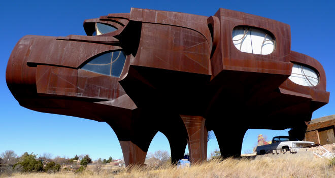
- Robert Bruno's steel house.
When a potential client lands on your website, the first thing they want to be confronted with is a building that makes them go “woah!” Does your website make people go “woah!”? Or does it make them go, “Ewww!”?
Dark, drab images, bad angles, lots of rubbish or clutter in shots - or worse, no images at all - will give a bad impression to any visitor. They say, “This is an architect who doesn’t care about his work.” And
Your images can’t just be “good enough” - it is primarily the images that sell you, so they need to be spectacular. If you are not a talented photographer, and you can’t rope a friend into doing them, you’re going to need to hire a professional to shoot and edit images of your buildings. A little upfront expense is worth it in referrals in the long-run.
Make sure that surfaces are clean and tidy, spaces are free of rubbish and clutter, and there are no unfinished spaces in the picture. You’d be surprised how many beautiful images are ruined by a stray shopping bag or soda can.
Website Mistake 2: No Contact Info
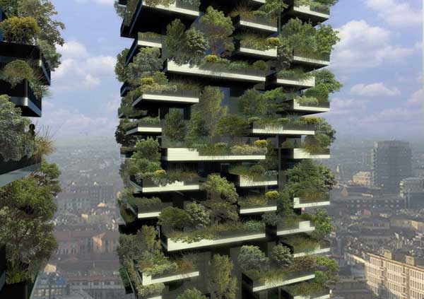
- Designed by Stefano Boeri, Milan.
Despite the whole point of your website being to get clients to contact your to discuss their projects, you’d be surprised how many architects just plain forget to include their contact information. Seriously.
Make it super-easy for potential clients to contact you. If possible, put your phone number or a link to your contacts page on every page of your website. Some architects use their contact details in the watermark on their photographs (which is a great idea if photos are being shared on social media). Have multiple ways for clients to contact you - many people use a contact form these days, but you can also supply a phone number and email address. And make sure your contact info is visible on your site - you have a button to navigate to the contact info (it’s not just tiny print at the bottom of the page!)
Website Mistake 3: Offensive Content
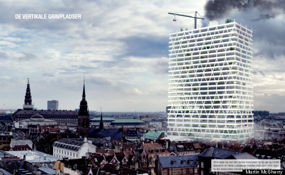
- Martin McSherry's Skyscraper Cemetery, Norway.
How much can you possibly offend people with architecture? Well, quite a lot, sometimes. People are strange creatures.
When creating your website, you’ve got to take into account the fact that not everyone visiting it will come from the same cultural background or think the same way you do.
This often crops up in copy that accompanies architectural images. Sometimes the architect or the copywriter will write a little blurb describing a property, and in that description, might say something insensitive - comparing the building to a particular culture, or the assets of a woman. The comment might be innocent, but a potential client takes offense, and BOOM, you’ve lost a job.
Or, you might have a blog where you write commentary about architecture in the news, and you try to keep it interesting by choosing a controversial opinion or chewing out a reporter or commenter. Usually, it’s best to avoid confrontational humour / content online. Sometimes it can be great for business - as people fall in love with your upfront attitude - but most of the time it ends up backfiring on the architect with a lot of negative press. What might seem like a harmless joke can actually cost you a client.
Before you publish anything, have it passed over by someone who is sensitive to issues that might cause offense. You could also have a professional copywriter look over your text to ensure you’re not doing something that could potentially turnoff customers.
Website Mistake 4: No Target Audience
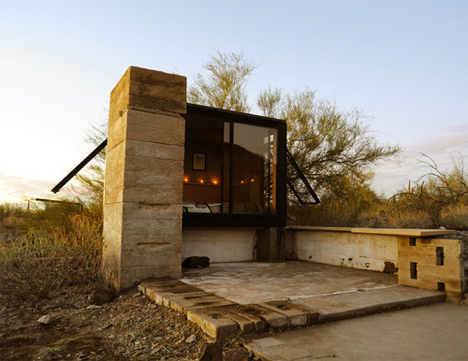
- Frank Lloyd Wright Miner's House.
This is perhaps the most common mistake costing architects clients through their website. Architects may create beautiful buildings, but that doesn’t mean you know anything at all about website design or layout. And yet, so many architects build their websites themselves, without going through the process of figuring out exactly what they’re doing and how their site will focus on that.
Architects do a lot of different types of buildings and projects, and it’s important to focus on only those that best represent the firm’s brand. So this means if you’re not doing any more commercial projects, to stop representing commercial projects. If you can’t stand brutalism, then don’t feature that brutalist building you worked on a few years ago because you “thought it would be a hoot”. Remember that your website needs to work for your practice for the next few years at least, so make sure the design reflects the direction the firm is going.
Use your website to relay visual information about your design ideals and aesthetics and the types of clients you like to work with. This is why it’s important to work closely with a graphic/web designer - to get the look right. Choose fonts and transitions and icons that speak to your brand - not just the ones you think look cool. Get the cohesive brand right first, and then worry about all the other details.
Are you an architect with a website? What mistakes have you made, and how did you fix them?